Retail lighting is no longer a simple matter of placing bright fixtures above aisles. It shapes product colour, customer movement, comfort, and perceived store quality. The International Energy Agency reports that lighting represents about 15% of global electricity consumption. This makes efficient planning commercially important, not merely technical. ENERGY STAR guidance also notes that qualified LED products can use at least 75% less energy than incandescent lighting and last much longer. However, lower energy use alone does not guarantee a successful retail environment.
This China Top Retail Store Lighting Layout Design Guide explains how to design a lighting layout for a retail store with practical, measurable decisions. It considers ambient, accent, task, and decorative lighting across entrances, shelves, display tables, fitting rooms, and checkout areas. The Illuminating Engineering Society recommends evaluating illuminance, glare, colour quality, and visual comfort together. A display may look dramatic under a narrow beam, yet appear harsh after five minutes of shopping. That detail is easy to miss. The guide also references CIE colour principles and energy-efficiency recommendations from the U.S. Department of Energy. Local ceiling height, daylight, merchandise colour, and operating hours still require on-site judgment. No published formula can replace a mock-up beside an actual product. A useful design can be adjusted after observation. Some assumptions may fail. Therefore, measurements, staff feedback, and customer behaviour should refine the final layout. The objective is balanced light: clear shelves, attractive merchandise, comfortable navigation, and controlled operating costs.
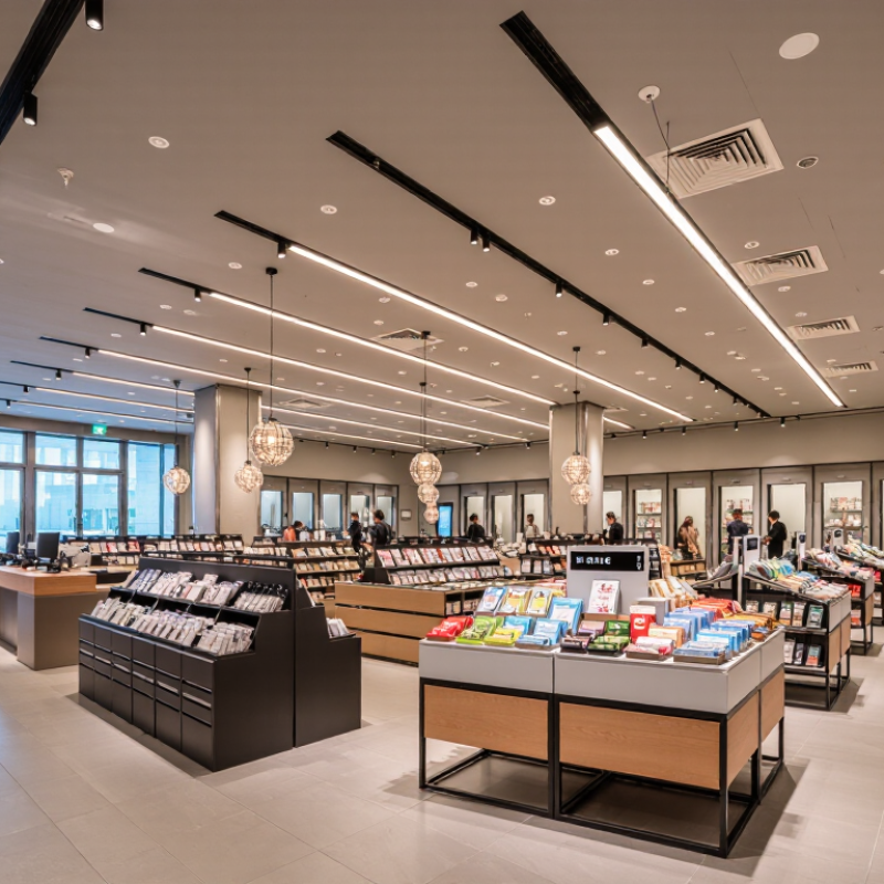
Effective retail lighting should guide movement, reveal product details, and create a comfortable emotional rhythm. A bright entrance can attract attention, but excessive brightness may feel harsh. Keep it calm.
Use layered lighting across the customer journey. Ambient light supports safe movement. Accent fixtures highlight displays, shelves, and feature walls. Vertical lighting helps customers read packaging and compare colors. In fitting areas, balanced light from several directions reduces unflattering shadows. Aim for accurate color rendering, especially near fashion, cosmetics, food, and home décor products.
A practical layout often begins with a customer walkthrough. Observe where people pause, turn, or ignore a display. Then adjust beam angles, mounting heights, and brightness levels. Warm light can make a lounge area feel welcoming, while neutral white light may improve product evaluation. Avoid strong reflections on glass, screens, and polished floors. Test before opening.
In real projects, the first lighting plan is rarely perfect. A display may appear attractive on paper but lose impact under ceiling glare. Customers may also avoid a corner that feels visually cold. Temporary mock-ups and evening inspections can expose these problems. Record customer behavior, staff feedback, and energy use after installation. Reliable decisions come from repeated observation, not appearance alone.
Space zoning should guide every lighting decision. In project reviews, I usually divide a store into entrance, circulation, display, fitting, and checkout zones. Each zone needs a different visual priority. Entrances benefit from clear vertical illumination. Shelves need even light on product faces. Fitting rooms require softer, balanced illumination from multiple angles. Hard overhead light can make skin tones look harsh.
Use contrast carefully. A brighter focal display can attract attention, but excessive contrast creates visual fatigue. Start with approximately 300–500 lux for general retail areas, then adjust after observing real merchandise and customer movement. The CIE and IES both stress glare control, color quality, and visual comfort in retail environments. ENERGY STAR reports that LED lighting uses at least 75% less energy and can last up to 25 times longer than incandescent lighting. The U.S. Department of Energy’s 2023 solid-state lighting report also highlights controls and lighting quality as continuing priorities.
Tips: Use a simple zoning map before selecting fixtures. Keep vertical light on shelves, not only the floor. Aim for high color rendering, especially near cosmetics and apparel. Test one aisle at different times. This matters. A layout may look perfect in drawings, yet feel flat in the store. I still find some plans over-light circulation areas and under-light product edges. That imbalance wastes energy and weakens the shopping path. Test, measure, and revise.
A strong retail lighting plan starts with the merchandise, not the ceiling grid.
Use adjustable LED track fixtures for displays that change weekly. Recessed downlights suit aisles, but fixed beams can leave shelves dark. Choose narrow beams for mannequins and wider beams for tables. Check glare from customer eye level. A low-glare optic matters near mirrors and polished packaging. I have seen bright stores feel uncomfortable because the light was aimed poorly.
Color temperature should support the shopping mood and product materials.
Warm white, around 2700–3000K, can soften furniture and hospitality areas. Neutral white, around 3500–4000K, often keeps apparel and general retail visually clear. Use high color rendering, preferably CRI 90 or higher, where fabric or food appearance matters. Keep one visual zone consistent. Mixing several white tones can make a small store look accidental. Avoid over-lighting. That mistake is easy to miss on a drawing.
Light levels need measured targets, not guesswork.
Many retail areas begin near 300–500 lux, while feature displays may need 500–1000 lux. The correct value depends on finishes, daylight, contrast, and local regulations. Measure horizontal and vertical illuminance after installation. Vertical light reveals labels and faces. Use dimming to balance daylight beside the storefront. Leave maintenance access and driver replacement in the plan. My own early layouts sometimes chased brightness instead of hierarchy. A quieter, uneven plan can guide attention better.
China Top Retail Store Lighting Layout Design Guide
Layering ambient, accent, and display lighting turns a retail floor into a guided visual journey. Ambient lighting should provide comfortable, even visibility across aisles and fitting areas. Use a neutral colour temperature, often 3000K to 4000K, to support accurate product perception. The U.S. Department of Energy reports that LED lighting uses at least 75% less energy than incandescent lighting and can last up to 25 times longer. That difference matters in stores operating long hours.
Accent lighting creates hierarchy. Aim adjustable spotlights at feature walls, mannequins, and seasonal displays. Keep bright focal points away from customers’ direct eye line. Display lighting then works at shelf level, where small shadows can hide texture, labels, and finishes. The International Energy Agency’s Energy Efficiency 2023 report identifies efficient lighting as a significant opportunity in commercial buildings. Use dimming controls and occupancy sensors where practical, but avoid excessive automation in high-touch areas.
A simple test helps. Stand at the entrance. Can you see the main display within three seconds? Walk deeper inside. Does the brightness change feel natural? My experience suggests that many layouts use too much accent light and create visual fatigue. This plan is not perfect. Reflective packaging, glossy floors, and changing daylight can still produce glare. Measure illuminance, check colour rendering, and adjust after observing real shoppers rather than trusting drawings alone.
Energy-efficient retail lighting begins with the sales journey, not fixture quantity. The International Energy Agency reports that lighting uses about 15% of global electricity. The U.S. Department of Energy states that LED systems can use at least 75% less energy than incandescent lighting and last up to 25 times longer. These figures support LED adoption, but wattage alone cannot evaluate a store. Designers should compare maintained illuminance, uniformity, glare, color quality, and operating hours. A bright entrance may attract attention, while excessive brightness near shelves can flatten product contrast. That mistake is common.
Maintenance deserves a place in the layout plan. Keep drivers, controls, and luminaires accessible without moving heavy displays. Record cleaning intervals and measure light levels after installation. Dust, aging, and changed merchandise can reduce visual performance. The Illuminating Engineering Society recommends evaluating lighting through measurable criteria, including illuminance and uniformity. Yet a perfect calculation may still feel uncomfortable. Human observation matters. Store testing should include staff feedback during busy periods.
Tips: Use zoning controls for entrances, aisles, displays, and checkout areas. Install occupancy or daylight sensors where operating patterns allow. Create a simple maintenance log with dates, measured lux, faults, and cleaning actions. Compare monthly energy use against sales-floor hours. Review the layout after seasonal changes, because temporary displays often block beams. Do not overlight every surface. Target the merchandise. Keep testing.
Good lighting guides movement, reveals products, and supports customer comfort. A bright entrance can attract attention, but excessive brightness may feel harsh.
Separate the entrance, circulation paths, displays, fitting areas, and checkout. Each zone needs a different visual priority.
Use clear vertical illumination so customers notice signs, displays, and product walls. Keep the entrance bright, but not painfully intense.
Ambient light supports safe movement. Accent light highlights feature walls and mannequins. Display lighting reveals labels, textures, and finishes on shelves.
Begin around 300–500 lux for general areas. Adjust after testing real products, customer movement, and changing daylight.
Neutral light around 3000K–4000K often supports accurate product evaluation. Warmer light can make lounge areas feel more welcoming.
Use balanced light from several directions. Strong overhead light can create harsh shadows and make skin tones look unpleasant.
Keep bright fixtures away from direct eye lines. Check reflections on glass, screens, glossy packaging, and polished floors.
Drawings can hide problems. A display may lose impact under ceiling glare, while a corner may feel cold and ignored.
Stand at the entrance and find the main display within three seconds. Walk through one aisle at different times, then record customer and staff feedback. Some plans still over-light circulation areas and under-light product edges. Revise them.
This guide explains how to design a lighting layout for a retail store that improves visibility, supports product presentation, and creates a comfortable customer experience. It begins with defining lighting objectives, such as guiding shopper movement, highlighting key merchandise, strengthening store atmosphere, and making product colors appear natural. The layout should divide the space into clear zones, including entrances, aisles, display areas, checkout points, and fitting or service spaces, with each zone receiving lighting suited to its purpose.
The guide also covers how to select suitable fixtures, color temperatures, brightness levels, and beam angles for different retail environments. A balanced combination of ambient, accent, and display lighting can create visual hierarchy while avoiding glare and excessive contrast. Finally, it emphasizes energy efficiency, convenient maintenance, flexible controls, and regular layout evaluation. By reviewing customer behavior, product visibility, and overall comfort, retailers can continuously improve lighting performance and create a more effective, welcoming shopping environment.

Lili Light