Choosing downlight color temperature in 2026 requires more than picking “warm” or “cool.” It affects comfort, visibility, material appearance, and perceived room size. The U.S. Department of Energy’s 2024 Solid-State Lighting R&D Opportunities report highlights color quality, controllability, and human-centered lighting as continuing industry priorities. That matters in real spaces. A 2700K downlight can soften a bedroom, while 4000K can sharpen details in a kitchen or workspace.
But color temperature is not the whole story. The Illuminating Engineering Society’s TM-30 method evaluates fidelity and gamut more deeply than basic CRI alone. CIE guidance also reminds designers that observers, surfaces, and surrounding light can change color perception. A white countertop may look clean under 4000K, yet appear slightly gray under a poorly rendered source. Small differences become obvious at night.
So, how to choose the right led downlight color temperature? Start with the room’s function, finishes, daylight exposure, and expected evening use. Warm light often supports relaxation. Neutral light can balance comfort and task visibility. Cooler light may help detailed work, but excessive blue content can feel harsh. Personal experience still matters. No chart can predict every home.
Reviewers should compare samples in the actual room, not only on a product webpage. Check CCT stability, CRI, TM-30 results, dimming performance, glare control, and flicker data. The evidence is useful, but not perfect. Lighting decisions deserve measurement, observation, and a little humility.
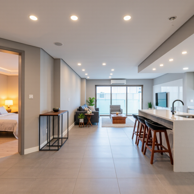
Downlight color temperature describes the appearance of white light, not the fixture’s physical heat. It is measured in Kelvin (K), using a scale linked to the color of heated objects. Lower values look warmer and more amber. Higher values appear cooler, bluer, and closer to daylight. It is not brightness.
A 2200–2700 K downlight can create a soft, relaxing mood in bedrooms and living rooms. Around 3000 K gives a warm white that suits kitchens, hallways, and general home lighting. Values near 3500–4000 K look cleaner and sharper, helping with desks, workshops, and detailed tasks. Above 5000 K may feel too stark for many homes, especially at night.
Test the color beside your walls, flooring, and furniture. Paint can shift the perceived tone. I once expected 3000 K to look neutral, but warm wood made it appear noticeably golden. That was a useful mistake. Color temperature also does not tell you color accuracy, so check the CRI rating when choosing downlights for artwork, food, or clothing. A consistent Kelvin value usually creates a calmer ceiling, but different rooms may need different choices. Use dimming carefully; a bright 4000 K light can feel harsh after sunset. A warmer setting often feels easier on the eyes.
| Color Temperature | Visual Appearance | Recommended Downlight Applications | Atmosphere | Advantages | Selection Notes |
|---|---|---|---|---|---|
| 2,200–2,700 K Extra Warm White |
Amber to warm yellow, similar to candlelight or incandescent light | Bedrooms, lounges, restaurants, hospitality areas, decorative niches | Intimate, relaxing, traditional | Creates a comfortable evening environment and softens interior finishes | May make white walls appear creamier and can reduce the perceived brightness of task areas |
| 2,700–3,000 K Warm White |
Soft white with a noticeable warm, slightly yellow tone | Living rooms, bedrooms, dining rooms, hotel rooms, residential corridors | Welcoming, calm, residential | Works well with wood, fabric, warm paint colors, and residential furnishings | A common residential choice; check samples because the same Kelvin rating can look different between fixtures |
| 3,000–3,500 K Soft Neutral White |
Balanced white with less yellow than warm white | Kitchens, bathrooms, open-plan homes, retail displays, reception areas | Clean, comfortable, adaptable | Balances visual comfort with useful task visibility | A practical compromise when one space serves both relaxation and daily tasks |
| 3,500–4,100 K Neutral White |
Clear white with minimal yellow or blue appearance | Offices, classrooms, kitchens, clinics, workshops, utility areas | Focused, balanced, professional | Supports detail visibility while remaining more comfortable than very cool light | Useful for spaces where accurate visual judgment and long occupancy are important |
| 4,100–5,000 K Cool White |
Bright white with a subtle cool or bluish impression | Commercial spaces, laboratories, garages, healthcare work areas, task lighting | Alert, crisp, functional | Improves the visual definition of details and supports a clean appearance | Can feel too harsh in bedrooms, lounges, and other relaxation-focused rooms |
| 5,000–6,500 K Daylight White |
Distinctly cool white with a blue daylight appearance | Inspection areas, precision workspaces, some retail and industrial environments | Energizing, high-contrast, technical | Can enhance perceived sharpness and contrast for detailed visual tasks | Use selectively; excessive cool light may reduce comfort and make interiors feel less welcoming |
|
What Does Kelvin Mean? Kelvin (K) is the unit used to describe the correlated color temperature (CCT) of a light source. Lower Kelvin values produce warmer, more yellow or amber light, while higher Kelvin values produce cooler, whiter or bluer light. Kelvin describes the appearance of light, not its brightness, energy efficiency, or color-rendering quality. |
|||||
|
Key Factors to Check Before Choosing a Downlight 1. Match the color temperature with the room's function and desired mood. 2. Consider wall colors, flooring, furniture, and the amount of natural daylight. 3. Check the Color Rendering Index (CRI); a CRI of 80 or higher is commonly suitable for general lighting, while CRI 90 or higher is preferable where color accuracy matters. 4. Confirm beam angle, lumen output, glare control, dimming compatibility, and fixture placement together with color temperature. 5. For connected or tunable-white downlights, verify the available CCT range and whether the control system supports smooth color-temperature adjustment. |
|||||
Note: Color-temperature categories are practical lighting guidelines rather than universal boundaries. The appearance of a downlight may vary with optics, LED design, surrounding surfaces, dimming level, and ambient daylight.
It describes how white light looks, not how hot the fixture becomes. Lower Kelvin values look warmer and more amber. Higher values appear cooler and bluer.
No. Kelvin measures light appearance. Brightness depends on lumen output, beam angle, and dimming.
Choose around 2200–3000K for relaxed spaces. This light resembles late-afternoon sunlight. It softens wood, beige fabrics, and skin tones.
Around 3500–4000K often keeps white surfaces looking clearer. It supports cooking, grooming, and other detailed tasks. Very cool light may feel too clinical.
Usually, no. Light above 5000K can feel stark at night. It may make a bedroom feel less restful.
Yes, often. Try 3000K in living areas and 4000K near desks or worktops. A mixed plan can feel more natural.
Yes. Warm wood may make 3000K appear noticeably golden. White paint can also look slightly yellow under warm light. I underestimated this once.
No. Check the color rendering rating when viewing artwork, food, or clothing. A light can look pleasant but still distort colors.
Test the light beside your walls, flooring, and furniture. View it during daytime and after sunset. Dimming can reduce harshness, but it cannot fix every mismatch.
Choosing the right downlight color temperature starts with understanding the Kelvin scale, which describes whether light appears warm, neutral, or cool. Warm light, typically around 2700K–3000K, creates a cozy and relaxing atmosphere for bedrooms, living rooms, and dining areas. Neutral light, around 3500K–4000K, offers a balanced appearance suited to kitchens, bathrooms, offices, and general-purpose spaces. Cool light, often 5000K or higher, provides a crisp, energetic feel for work areas, garages, and task-focused environments.
To learn how to choose the right led downlight color temperature, consider each room’s function, existing daylight, wall and floor finishes, and nearby fixtures. Also think about visual comfort and energy use rather than brightness alone. Consistent color temperature can make a space feel more coordinated, while dimming and smart lighting controls allow the atmosphere to change throughout the day. By balancing appearance, practicality, and flexibility, you can create lighting that feels comfortable and performs well in every room.

 Lili Light